
In Telegraph Avenue, Michael Chabon wrote a 12-page sentence. When asked about the sentence, Chabon responded that he wanted to give the readers a tracking shot so readers understood what was going on. For my readers who want to know where I am, here’s my tracking shot:
Trump was elected president (I stayed up till the bitter end); Emily and I conducted two interviews and got about an hour’s worth of usable conversation; my cat killed a snake, brought it in the house, and hid it under my housemate’s bed for safekeeping; Emily and I made some major changes to the blog that should be functional and aesthetic improvements; most of these changes–especially changing our theme–made obsolete all of the work I did last week; I’m annoyed that a lot of my work seems to be for naught, but excited every time I learn a new way of making something accessible, every time I learn a new technology of visual rhetoric; we had really great conversations about the uniqueness and importance of liberal arts, as well as the future of higher education; it turns out my housemate is terrified of snakes, and the snake wasn’t completely dead; incredible dialogues began on campus regarding the importance of liberal arts institutions as enclaves of resistance and protection; I found some great sources that will contribute to our project; Emily’s timeline blew my mind; I didn’t have time to start either of the essays I have due tomorrow (Monday the 14th) until 1Pm today (Sunday the 13th); I’m excited that I get to blog for this course and have the opportunity to take risks like this post; starting at 4Pm on Friday, 50 of my teammates and I drove six hours to New Jersey, slept at the house of the TCNJ tracksters (who we had never met before), woke up and drove to Rowan college to support our top-7 men and women competing at the Atlantic Region cross country championship, painted our bodies and sprinted back and forth through a broccoli field to catch the runners as many times as possible (both teams won handily and qualified for the NCAA championship), we drove six hours home and returned at 4Pm on Saturday; I had serious writer’s block on my senior thesis; I was forced to re-evaluate my plan for the next several years in anticipation of cuts to higher-education spending; while writing a paper about Autism, I was fascinated by the ways other cultures approach the disorder; I continued to transcribe interviews and research SUNY general education requirements; I mapped the route to drive to Louisville, Kentucky to support my teammates at the NCAA championship this Friday–the men are ranked 2nd in the country and the women are ranked 3rd; a swastika with the word “trump” above it was found graffiti’d in a dorm on Geneseo’s campus.
I’m having trouble distinguishing between the difficulties of this project and the rhetoric surrounding the treatment of humans in this country: most of a person’s labor is hidden from sight, and hidden labor is so often considered a lack of labor. Which isn’t to say I think the difficulties of this project are equivalent to the plight of so many people in this country, but that this election has consumed all of my thoughts and emotional resources (and I recognize my incredibly privileged status). So in the spirit of uncovering hidden labor, I’m going to use pictures (and a few words) to illustrate the potentially trivial changes I made to our project website in pursuit of some thing called excellence. (I can only imagine what Derrida–in all his confounded genius that borders on idiocy–would have to say about this “thing”). Hopefully, allowing these pictures to “speak” will achieve some symbolic act of removing my voice so that another “voice” can gain access to the conversation.
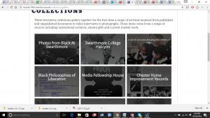 –this was the guiding website.
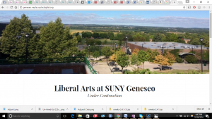
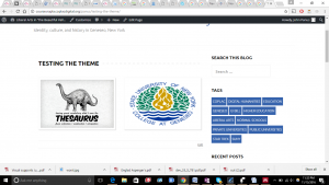
 –here’s where we started.
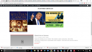
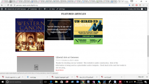
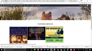
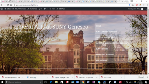 –after testing some themes, this is what I got. I think the picture of Geneseo works extraordinarily with this theme, but we’ll have to do some editing with the font, colors, and menu.
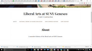
 –here’s a template of how I thought the theme would work.
 –that didn’t happen. When you add pictures to the home page, the site works differently. Obvious issues.
 –the hover aspect is nice. But this theme does it automatically–whereas I spent hours working with plugins to get this affect on the other theme.
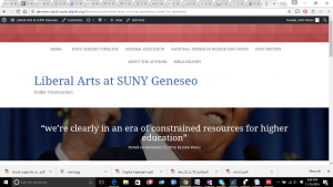 –and when you click on the site, it takes you to this page (which will later be filled with information). I had to do some editing to get here, and didn’t take all the picture to prove it.
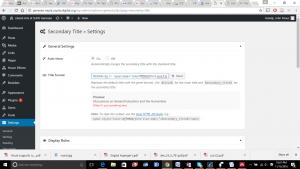
 –this small change from the original hover effect is the change I’m most impressed with. I had to do some SERIOUS coding:
 –changing font size and color. Putting in a line break so there’s a primary title (the quote) and a secondary title (the question).
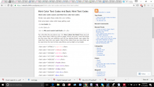 –and I seriously appreciate the people who paved the way before me.
More interviews this week. And I’m hoping to dump a ton of information on the blog. Ideally, in a coherent manner.